
September 4, 2012
If design concepts seem like Lorem ipsum to you, take our crash course with these great design tips!
1. Spacing
Less is more! The basic mentality for most people is “fill the space”, which leads to things looking messy and cluttered. Allow images and text to breathe. White space in your design will draw the eye to more important components. If your layout is unorganized, the reader won’t know what to focus on and you run the risk of losing your main message.
Essential as it is to leave space amongst design elements, it is also important to stay clear of page edges. Give yourself at least a quarter inch border.
2. Typography
Choosing a typeface (font) is another key component to good design. The typeface(s) you choose will drive the overall look and feel of your design. Mixing fonts is an art and takes time to get the hang of. I suggest looking at examples from other designers who have already accomplished the same aesthetic you are trying to achieve. It’s not cheating, it’s just how we learn what works well.
If you choose to mix typefaces, keep it simple. No more than 2-3 font choices in any design.
Tip to save the world: Unless you are designing a birthday invitation for a three year old, please never use comic sans!
3. Body Copy
Creating great content for your design is a task in itself. So don’t ruin your hard work by making some of these common design errors:
- Width: Keep paragraphs at a legible length. A good rule to stand by is not having paragraphs with more than 10-12 words in a line. Shorter sections are easy for readers to digest.
- Leading (the distance between lines of type): It can be difficult to find a happy medium for how much space you should allow in your body copy. Generally the default value is too little spacing. Give lines enough air to breathe, but not too much that a reader’s eye can be easily lost.
- Widows and Orphans: These are common terms that typographers refer to as single words at the beginning or end of a paragraph.
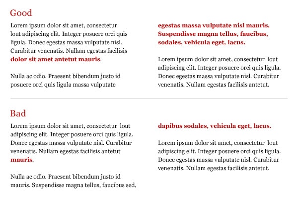
Paying attention to these small details can help take your design to the next level.
4. Color Palette
Choosing your color palette can be a difficult and daunting task. A good place to start is by picking colors that you already know convey the feeling you’re designing for. Again, keep it simple. Pick two primary colors and one or two subtle secondary colors as an accent. No more than 5 colors tops!
If choosing the perfect color just isn’t your expertise, try getting some help from this favorite designer site: www.kuler.adobe.com where you can search by category or theme and view a variety of other designer choices. The best part is Kuler gives you the HEX number so you can get the colors spot on.
5. Consistency
Even if you have failed at all the categories above, keeping your design consistent can save everything. Make choices in the beginning and then stick with them. Make sure all the headings, subheadings, spacing, fonts, etc. are the same throughout. It can be easy to get off track once you dive into things, so make it a habit to revisit these areas once you’re done.

Get the latest news
Blog Topics
- Analytics
- Branding & Identity
- Budget
- Construction
- Content Marketing
- Conversion Rate Optimization
- Email Marketing
- HubSpot
- Inbound Marketing
- Lead Generation
- Marketing Strategy
- News/Events
- Paid Search & PPC
- Recruiting
- Sales & Marketing
- Sales Enablement
- Search Engine Marketing
- Search Engine Optimization
- Social Media
- Thought Leadership
- Uncategorized
- Usability
- Video Marketing
- Web Hosting
- Website Design